Color Language
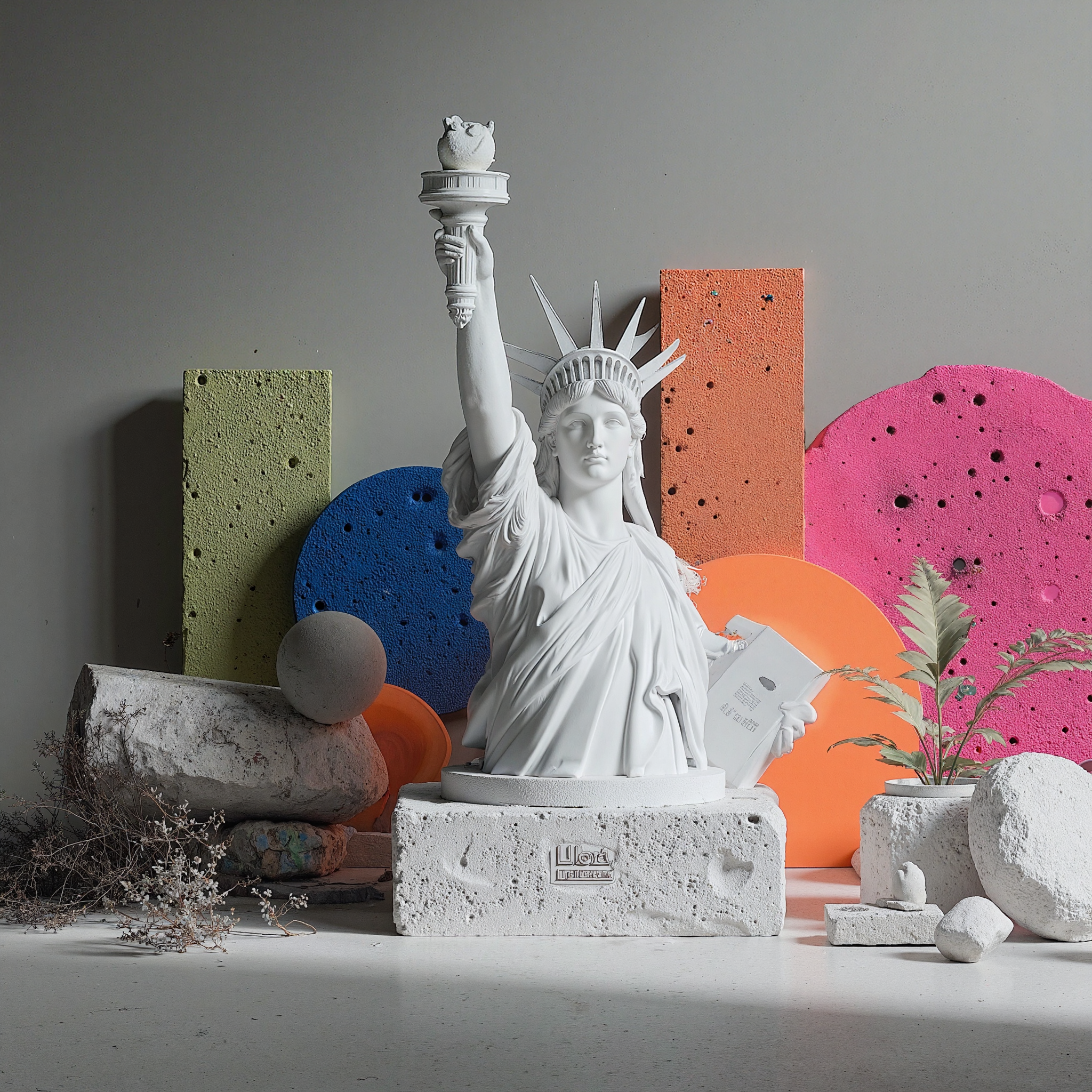
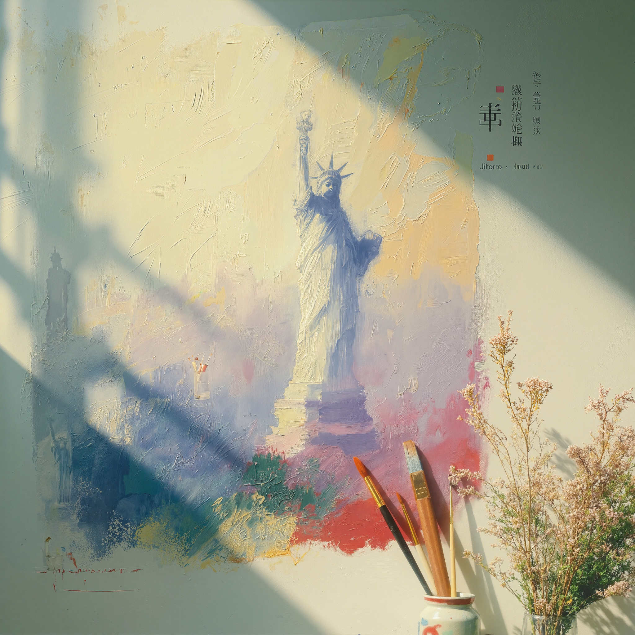
Primary palette blends burnt oranges with sage concrete. Use gradients and overlays to mimic painted walls catching slant light.
Ratio — 60 / 25 / 15
Immersion gallery
Use this scrollable filmstrip to source tonal references. Each frame ties to a studio story — from Liberty-inspired murals to macro plaster textures.
02 • Brand Identity
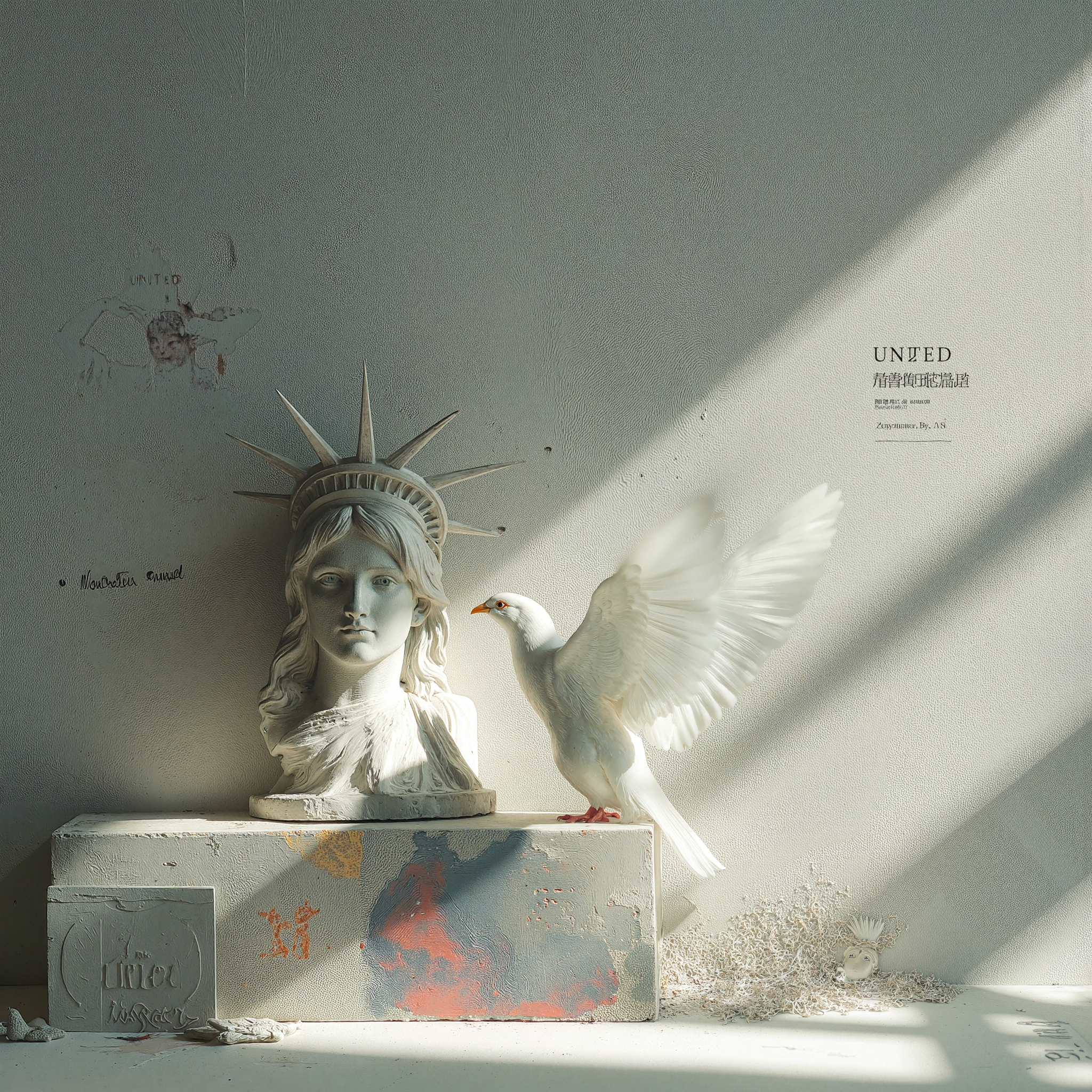
Think plaster walls catching a diagonal slice of afternoon light—burnt oranges, desaturated greens, charcoal blacks, and off-whites that feel powdery and matte. Typography should feel like museum placards: serif statements, grotesk body copy, and micro-type metadata whispering along the edges.
Primary palette blends burnt oranges with sage concrete. Use gradients and overlays to mimic painted walls catching slant light.
Ratio — 60 / 25 / 15
Pair sculptural serif headlines with quiet grotesk paragraphs and whisper-thin uppercase metadata. Treat type like carved etchings on plaster—precise, deliberate, never shouting.
Reference imagery pairs plaster gradients with charcoal studies. Use this macro crop treatment for hero backups or transitions.
03 • Interface Components
Buttons & Toasts
Primary actions carry burnt-orange fills while secondary options lean on terracotta and sand. Toasts inherit the same hues for instant recognition.
We'll confirm your consultation slot within 24 hours.
Masato's calendar just opened for February.
Interface Treatments
Forms and calendars that echo studio serenity.
Studio Calendar
04 • Layout & Components
Think in horizontal galleries: alternate full-width manifesto blocks with modular cards so the page rhythm breathes like walking past framed works.


05 • Interaction & Motion
Hover swatches to tint background
06 • Sticky Storytelling Example
Use sticky paired columns for case studies or process pages: the left rail sets expectations, the right column scrolls through vivid chapters.
Client brings mural references, sculptures, and light studies. Capture quotes and palette swatches directly in the viewport.
Use macro photography of charcoal lines and plaster chips. Pair with captions outlining needle groupings and pigment blends.
Document progression with warm gradients + timestamps to show layering, wiping, and varnish moments.
Close with archival photography and care steps so the story resolves with confidence.
07 • Tone & Messaging
Balance poetic descriptions with precise process language. Speak to seasoned collectors, not trend chasers.
08 • Reference + Guardrails